Ambiguity as a design strategy
Robin Verpoort
Master Architectuur
2021 — 2022
studio
High-rise
promotoren
Bart Hollanders
Sven Verbruggen
medestudent
Polle Metten
Ambiguity as a design strategy
We started this design by looking at how Adler and Sullivan made Architecture in the auditorium building. Adler was an engineer and, therefore, a realist, while Sullivan was more a dreamer and decorated architect, but when these two came together, their architecture became the most qualitative. This quality lies in the ambiguity of their architectural elements.
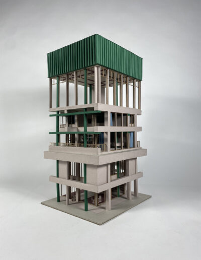
With the interests we gained from Adler, Sullivan, and Wright, it only seemed fitting for us to finish this master thesis where we started it, in Chicago. Therefore we worked on the Chicago tribune plot for this high-rise design to make our own proposal a hundred years after the original competition took place. Because Sullivan purified that a high-rise building is only a plinth, a body, and a crown, we designed a building by only focusing on these three parts. By doing this, we wanted to show that Sullivan’s theory of a high-rise building is still relevant today and that the whole can be introduced and understood by only focusing on some floors and the details of a building.
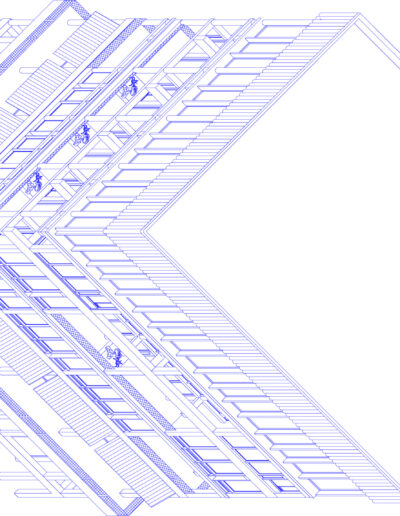
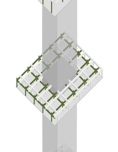
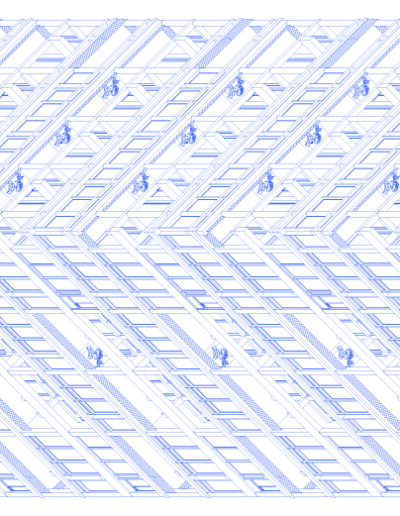
We started this design by making two precisely the same grids, one for the structure and one for the shafts. Both grids will act as one complementary structure inside the building. When we found the ideal proportions for our design, we started modelling it in a plinth, a body, and a crown, each with its own way of using the structural and shaft system grid. By doing this, we wanted to create three different kinds of ambiguous structures so that if you walk thru the building, it is a continuous search to understand which system carries the building and which is used as shafts. By dealing with this differently in each part, you can also read the building in different ways.


